If your academic calendar planning in Microsoft 365 feels like it is working, you probably cannot see the full picture yet.
Most operations directors and cross-departmental planning leads in large universities believe their planning problem is a communication problem. Send more updates, hold more alignment meetings, build a better SharePoint page. But the real issue sits one level deeper: your teams are not working from an incompatible tool. They are working from an incompatible shape. Linear lists and flat Gantt charts cannot represent a cyclical academic year. The moment you try to plan two semesters, an accreditation window, an open day season, and a staff appraisal cycle on a horizontal timeline, you lose the repeating logic that makes academic rhythms manageable in the first place.
This guide is written for operations directors and cross-departmental planning leads who manage planning governance across faculties, professional services, and senior leadership in large, complex institutions. If you coordinate multiple departments, work inside Microsoft 365, and spend too much time producing bespoke calendar views for different audiences, the steps below are for you.
TL;DR
- Academic calendars are cyclical. Linear tools create planning blindspots. - Faculty fragmentation, clash detection failures, and M365 adoption gaps are the most common pain points. - A circular year wheel gives every faculty and professional services team a shared visual language without overriding their autonomy. - Plandisc embeds directly in SharePoint and Teams, removing the "yet another platform" objection. - You can map semester rhythms, accreditation windows, and board cycles on one visual and share it across the institution. - Book a demo to see how it works in practice.
1. Audit where your calendar actually lives
Before you redesign anything, find out where planning decisions are actually being made. In most large universities, the answer is: everywhere and nowhere. Faculty A plans in Excel. Faculty B maintains a wall-mounted paper calendar. Central admin owns a SharePoint page that three people remember to update.
This fragmentation is not a behaviour problem. It is a governance problem. No one agreed on a single source of truth, so individuals defaulted to whatever tool felt familiar.
Start by mapping your current calendar touchpoints: which teams own which planning artefacts, how often those artefacts are updated, and who has access. You will almost certainly find that your Microsoft 365 environment contains the infrastructure for a shared calendar but that planning still happens outside it.
This audit gives you the evidence you need to make the case for a centralised visual planning approach. It also identifies your highest-risk coordination gaps: the places where two departments are planning in parallel with no shared view.
2. Map your semester rhythm before adding operational layers
You will save yourself significant rework if you build your calendar from the academic rhythm outward, rather than adding academic dates to an existing operational calendar.
Start with the non-negotiables: semester start and end dates, examination periods, graduation, enrolment windows, and any external accreditation review dates. These are your fixed anchors. Everything else is scheduled around them.
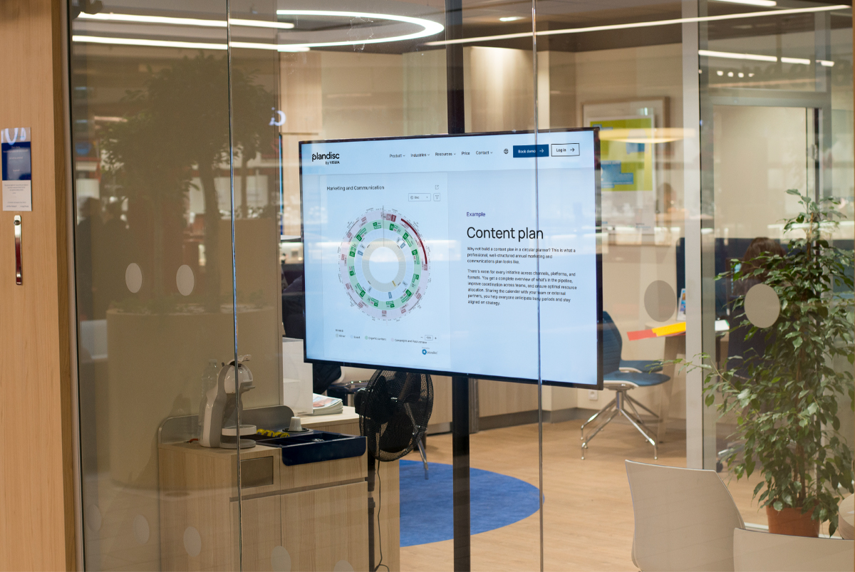
A circular year wheel format makes this step much easier than a linear timeline. When you plot two semesters on a circle, you immediately see the symmetry and the gaps. You can compare this October's examination period against last October's without scrolling back through a flat list. You can see at a glance whether your board meeting falls inside or outside an examination blackout period.
This visual logic is particularly useful when you are coordinating across professional services and academic departments simultaneously. Estates, IT, student services, and finance all have their own planning peaks. Mapping them against the academic rhythm on a single circular view reveals clashes before they become crises.
3. Identify your cross-departmental dependencies
Clash detection fails in most institutions because no single person or team has a cross-departmental view of the calendar. The quality assurance office knows its accreditation submission date. The estates team knows its planned maintenance windows. But neither knows what the other has scheduled until a conflict surfaces at a senior leadership meeting.
Your goal at this stage is to identify every point in the year where two or more departments need to coordinate their timing. Common examples include: open days that require IT, estates, student services, and academic departments to align; staff training days that clash with examination marking periods; finance reporting windows that overlap with semester start administrative peaks.
Document these dependencies explicitly. When you move to a shared visual calendar, these are the first cross-department layers you add to your base academic rhythm.
What does effective dependency mapping look like?
Effective dependency mapping does not require a complex project management tool. It requires a consistent visual language that every team can read. A colour-coded circular calendar, where each ring represents a different department or function, lets a planning coordinator see dependencies at a glance without needing to interpret a Gantt chart or read through a meeting agenda.
4. Choose a planning format your M365 environment can actually sustain
You already have Teams, SharePoint, and Outlook. The question is not whether to use Microsoft 365 for planning. The question is whether your planning tool fits inside the environment your teams already use.
This is where many institutions get stuck. A new planning platform creates an adoption barrier. Staff who are already managing Teams channels, SharePoint libraries, and Outlook calendars will not voluntarily add a fifth environment to their workflow. The tool you choose needs to sit inside M365, not alongside it.
Plandisc is built for exactly this scenario. Your circular year wheel plans embed directly in SharePoint intranet pages and share via Teams channels, so planning visibility lives where your teams already work. There is no separate login, no separate environment, and no version control problem caused by planning happening in two places at once. Microsoft's own research into M365 adoption consistently shows that integration with existing workflows is the primary driver of tool adoption across large organisations. Reducing friction at the point of access is not a minor convenience. It is the difference between a planning tool that gets used and one that gets abandoned.
Plandisc also supports role-based visibility, so senior leadership sees a summary view while faculty coordinators work with the full operational detail. You stop producing bespoke calendar exports for every audience and start maintaining one source of truth that surfaces the right level of detail for each stakeholder.
For institutions managing accreditation cycles, Plandisc lets you map preparation windows, submission deadlines, and review periods directly onto the academic rhythm. Accreditation milestones become visible to every relevant department, not just the quality assurance office. EDUCAUSE's Core Data Service documents the persistent challenge of administrative technology fragmentation in higher education, and shared visual planning directly addresses the coordination gaps that fragmentation creates.
5. Roll out in layers, not all at once
The fastest way to kill adoption of a new planning approach is to mandate it everywhere simultaneously. Start with one high-stakes coordination point, for example, the examination period planning cycle, and build your circular calendar around that.
Once one faculty or professional services team sees the value of a shared visual view, adoption spreads through demonstration rather than policy. Other teams ask to be included. That is the moment you expand the calendar to cover additional departments and planning horizons.
Build in a review point at the end of your first full academic cycle. What clashes did the shared calendar help you avoid? Where did the visual format reveal a dependency that a linear list would have hidden? Use those examples to make the case for broader adoption.
6. Establish clear governance for calendar updates
A shared calendar only works if everyone trusts that it is current. Define who owns each layer of the calendar, how updates are communicated, and what the process is when a date changes after it has been published.
This is especially important in institutions where academic departments and professional services operate on different planning cadences. Your governance model does not need to be complex. It needs to be explicit. Assign a named owner for each calendar ring, set a review frequency, and make the update process visible to all stakeholders.
7. Use the year wheel to support onboarding and knowledge retention
Every time a planning coordinator leaves, institutional knowledge about the academic calendar leaves with them. The unofficial understanding of why certain dates are fixed, which weeks carry the highest cross-departmental load, and where the historical clash points are, walks out the door.
A visual circular year wheel, maintained as a live document inside your Microsoft 365 environment, changes this. New planning staff can read the full annual rhythm in a single view. They do not need six months of institutional archaeology to understand why October is always problematic. The calendar shows them.
Research on knowledge management in complex organisations points consistently to structured visual documentation as one of the most effective ways to retain operational knowledge through staff transitions. A well-maintained year wheel is not just a planning tool. It is an onboarding resource.
What should an academic calendar planning tool include for large universities?
An effective academic calendar planning tool for large universities should include: a circular or year wheel format that maps the full annual rhythm visually, multi-department layering so academic and professional services calendars coexist in a single view, integration with Microsoft 365 so the calendar lives inside SharePoint and Teams, role-based visibility so different stakeholders see the level of detail appropriate to their role, and clear governance features that assign ownership of each calendar layer and make update history transparent.
If you want to see how Plandisc handles academic calendar planning in Microsoft 365 across faculties and professional services teams, book a Plandisc demo and we will walk you through a live example built around your institution's planning rhythm.
.jpg)